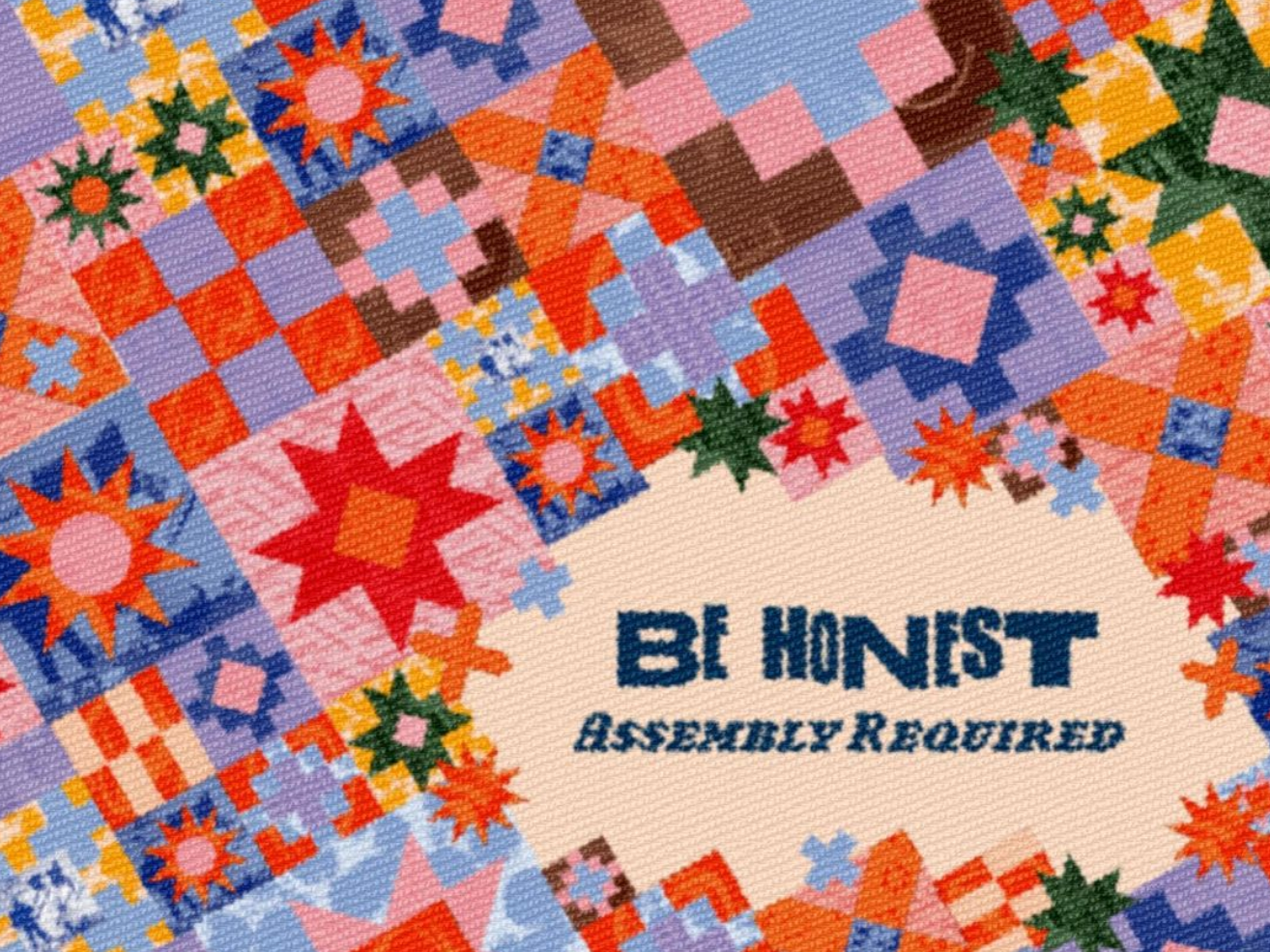
My goal was to evolve Hanna Andersson's brand while honoring its current concept, story, and mission instead of revolutionizing it and altering its foundation.
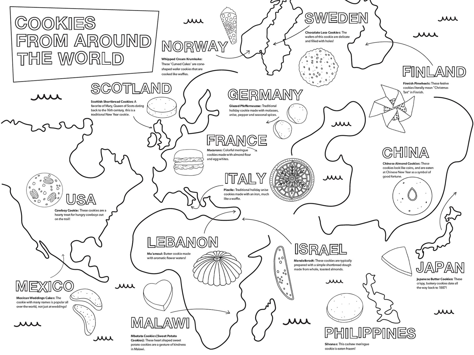
The branding deck includes a primary logo, supporting logos, children's coloring pages matching the Swedish folk-art aesthetic, a catalog, a hang tag, and a brand rules poster with assets.
Let their wardrobe be their choice!
The primary logo spells ‘Ha,’ a playful pun that monograms the company name while suggesting laughter. A flower illustration on the bottom right nods to Hanna’s illustration style. Below, ‘hanna andersson’ is spelled out in full, mirroring the clean, elongated look of the current logo.
Brand Poster Lock-up
Brand Poster, Back of Magazine, Hang-tag, In-store Business Card
Magazine Spread with Interactive Coloring page

